Client: Koryori
Area of Focus: Mascot Character & Supporting Brand Asset Design
Deliverables: Character concept exploration, proportion studies, pose library, five-character system guide, English and Korean typography, food illustration assets, environmental and in-store application
Year: 2026
Area of Focus: Mascot Character & Supporting Brand Asset Design
Deliverables: Character concept exploration, proportion studies, pose library, five-character system guide, English and Korean typography, food illustration assets, environmental and in-store application
Year: 2026
Koryori is a Korean street food brand based in Dhaka. The initial brief was to design one mascot character with some supporting assets.
The first round of exploration covered six distinct directions: a tiger rooted in Korean cultural symbolism, a mischievous alley cat, an anthropomorphic corn dog, a grandmother figure, a K-pop idol, and a food-based character. Each had a different tone, a different audience, a different story. The client shortlisted, reconsidered, and came back with a new direction entirely: the character won't be any animal or human and will have no face.
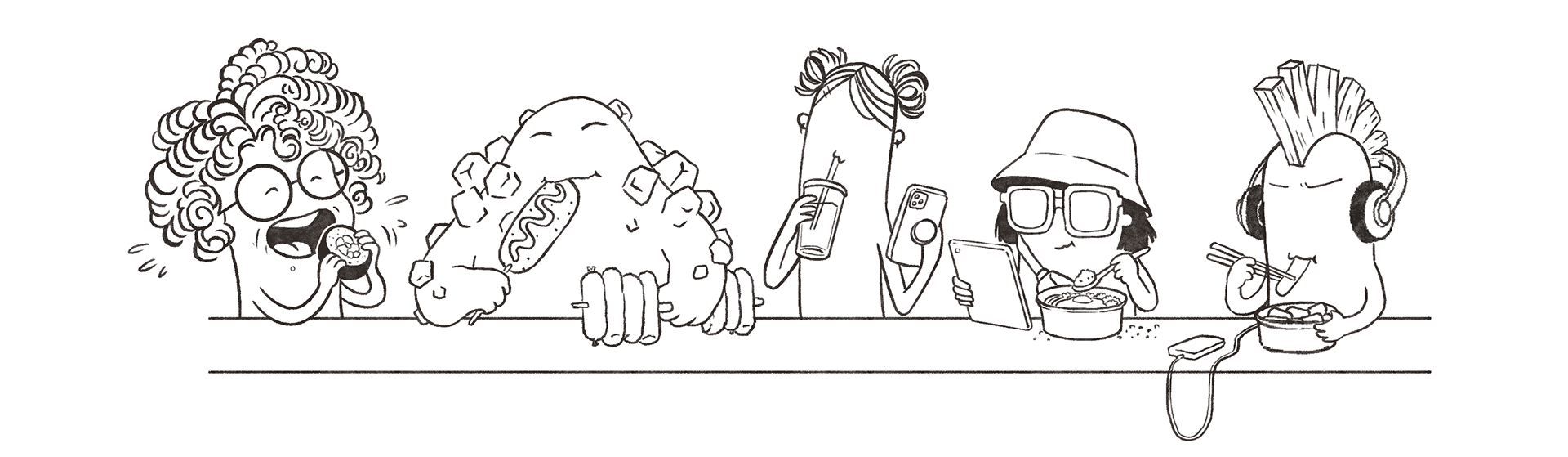
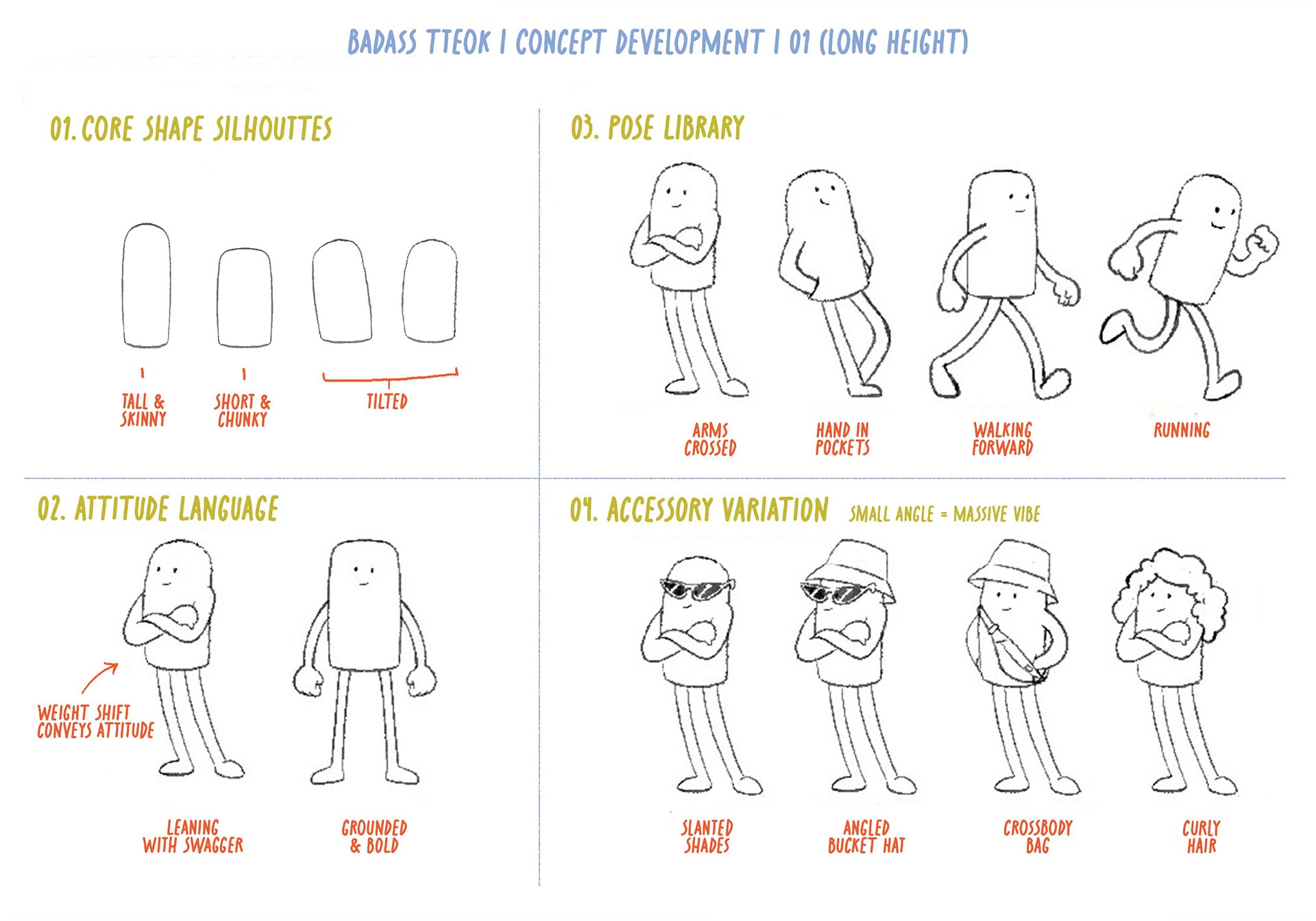
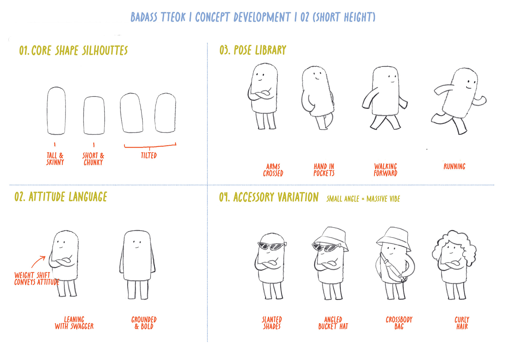
That constraint turned out to be the most interesting part of the project. Without a face to carry expression, everything else had to do the work: silhouette, proportion, posture, accessory. A second round of exploration looked at some faceless forms drawn from Korean street food references. The tteok, a traditional rice cake, was shortlisted for its minimal confidence and cultural rootedness. Two proportion studies followed, exploring how the same base shape could communicate completely different energies.
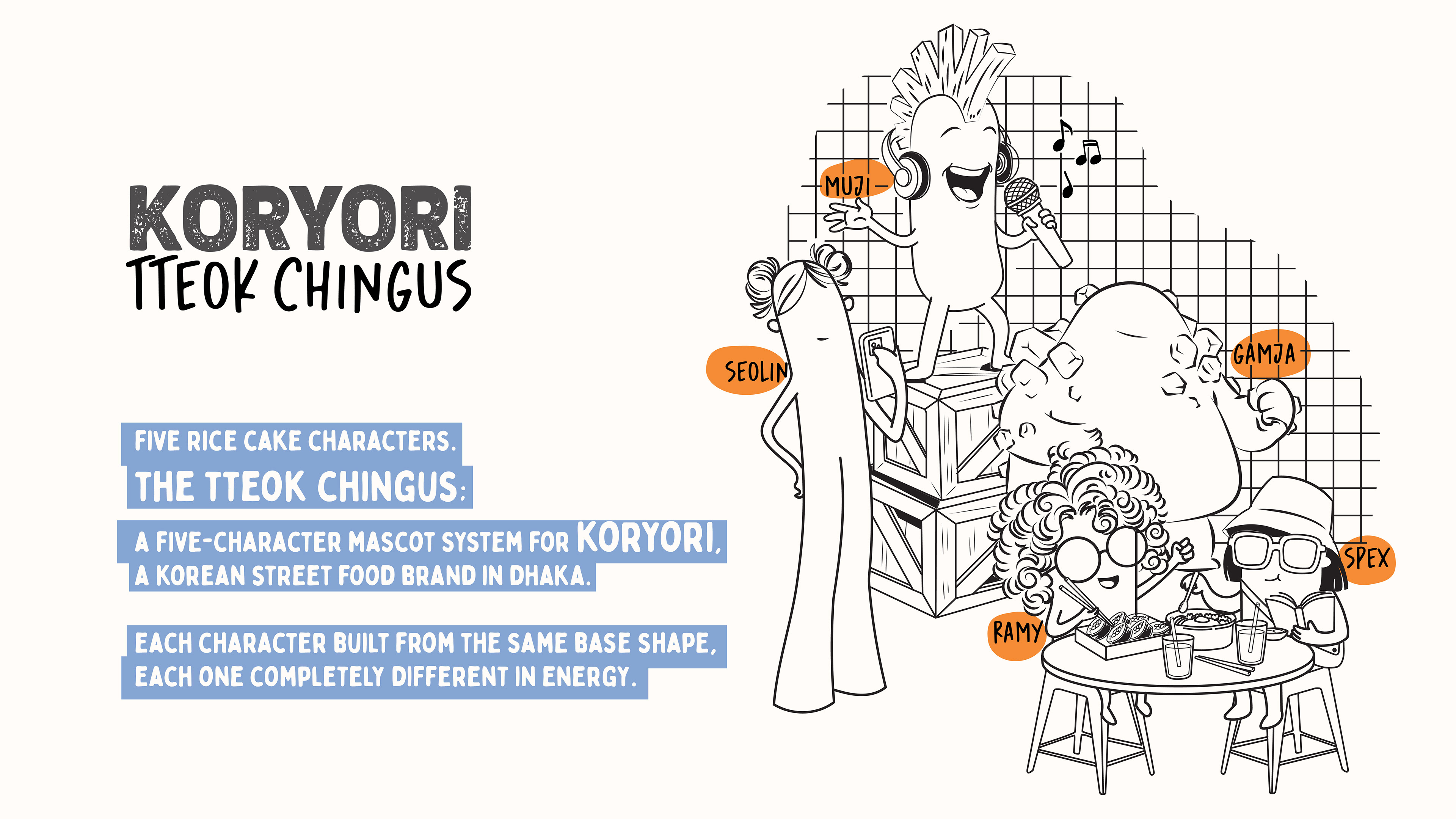
From there, five distinct personalities emerged.
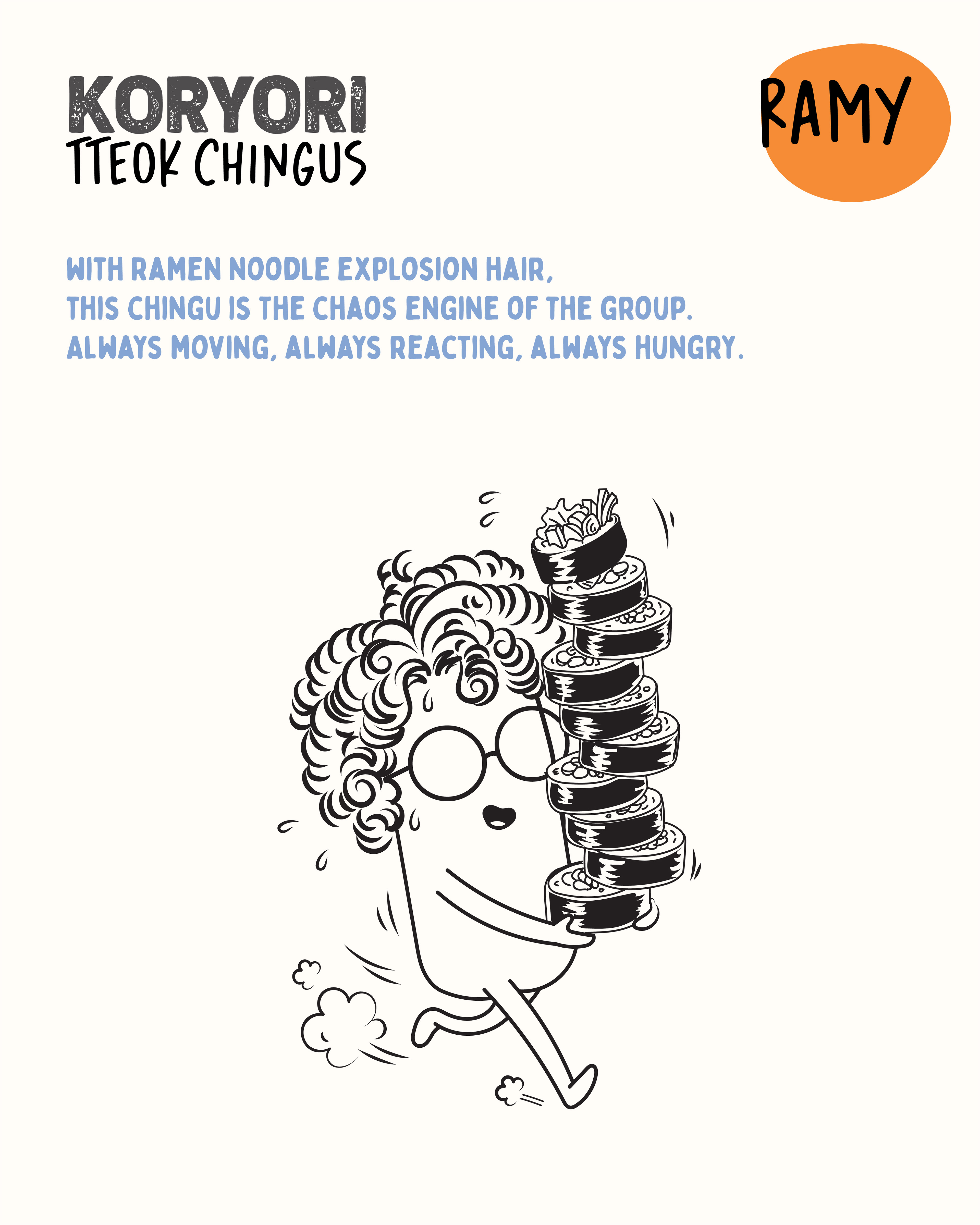
1. Ramy, the high-energy wildcard with ramen noodle hair.
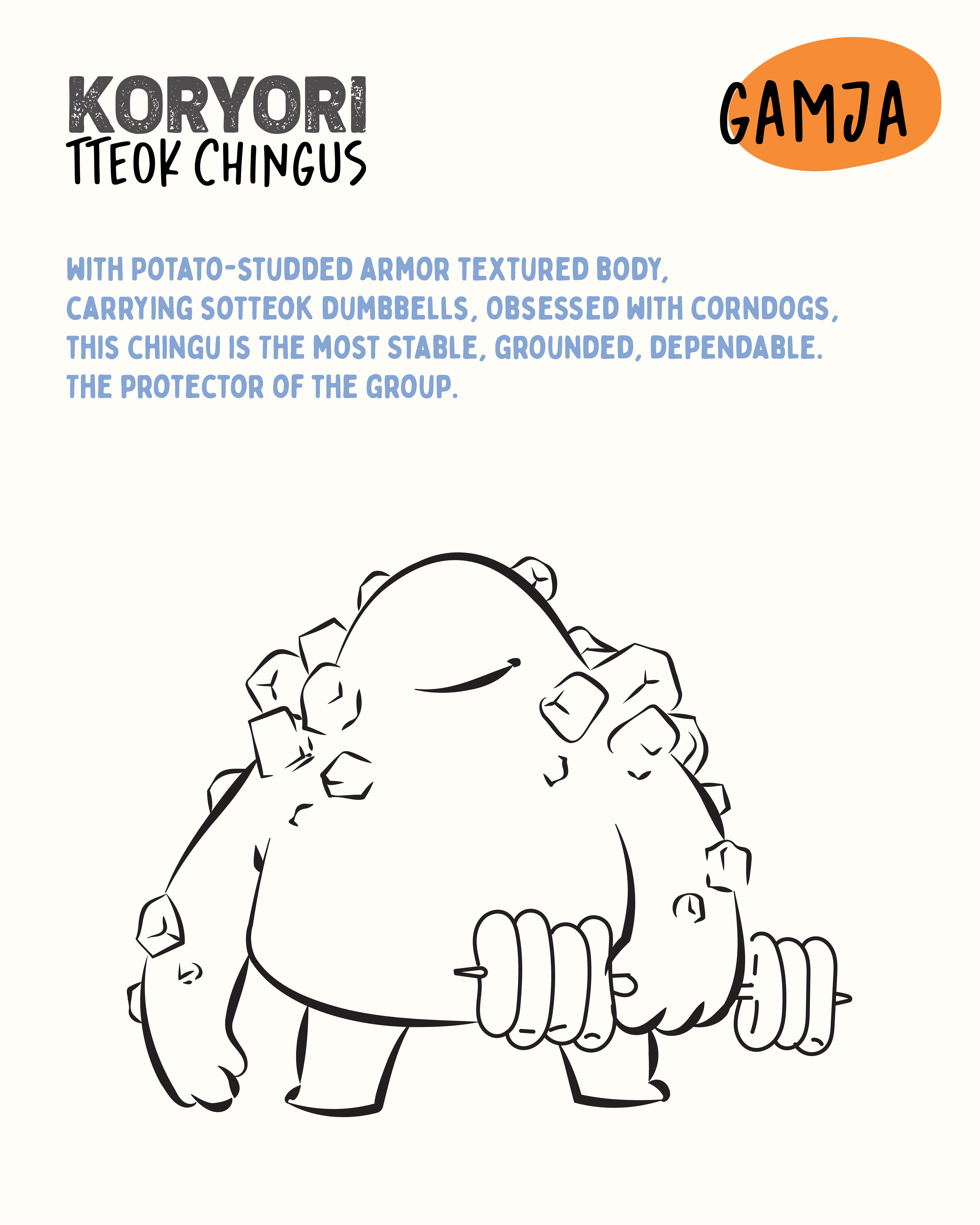
2. Gamja, the immovable tank in potato armour.
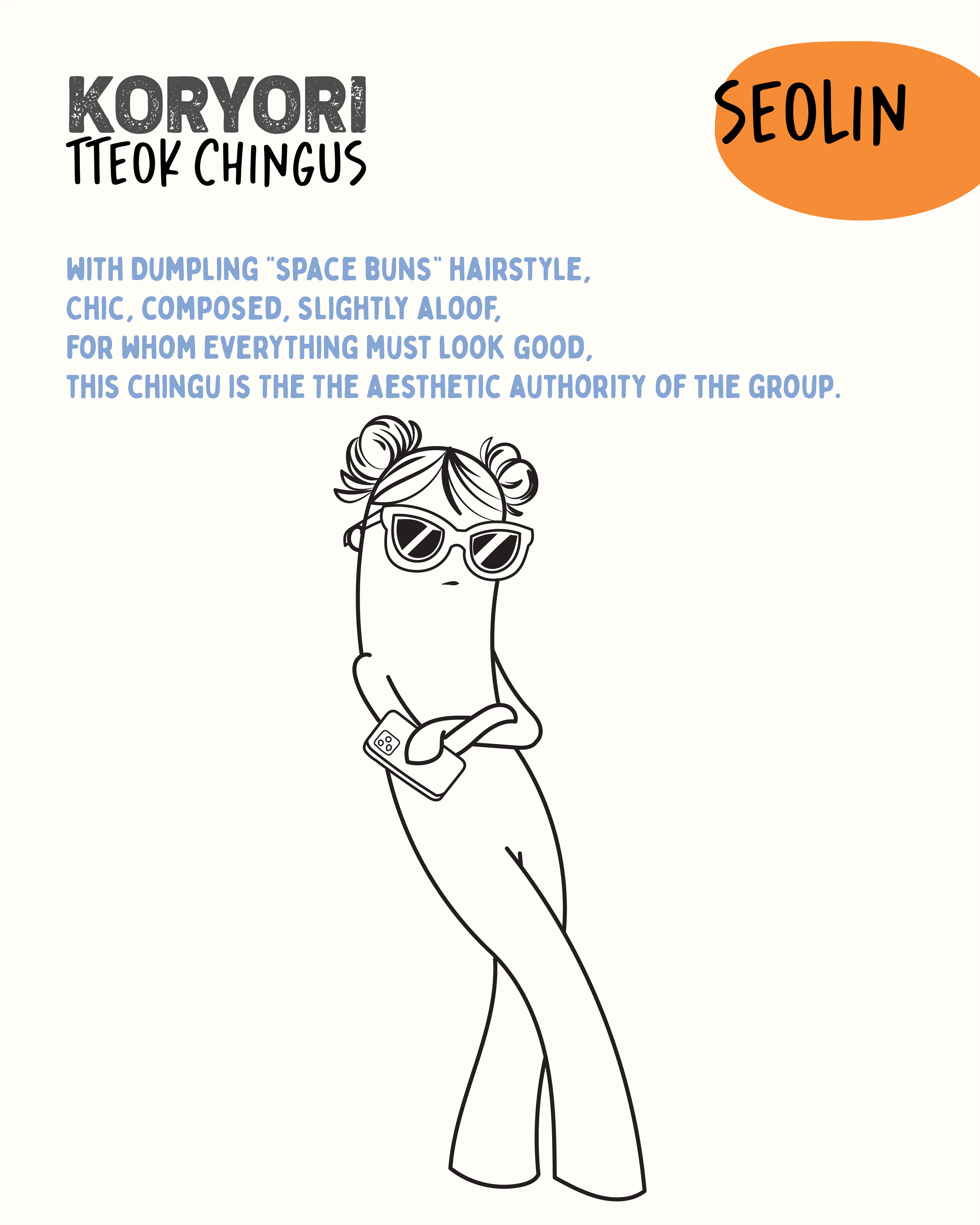
3. Seolin, tall and chic and completely unbothered.
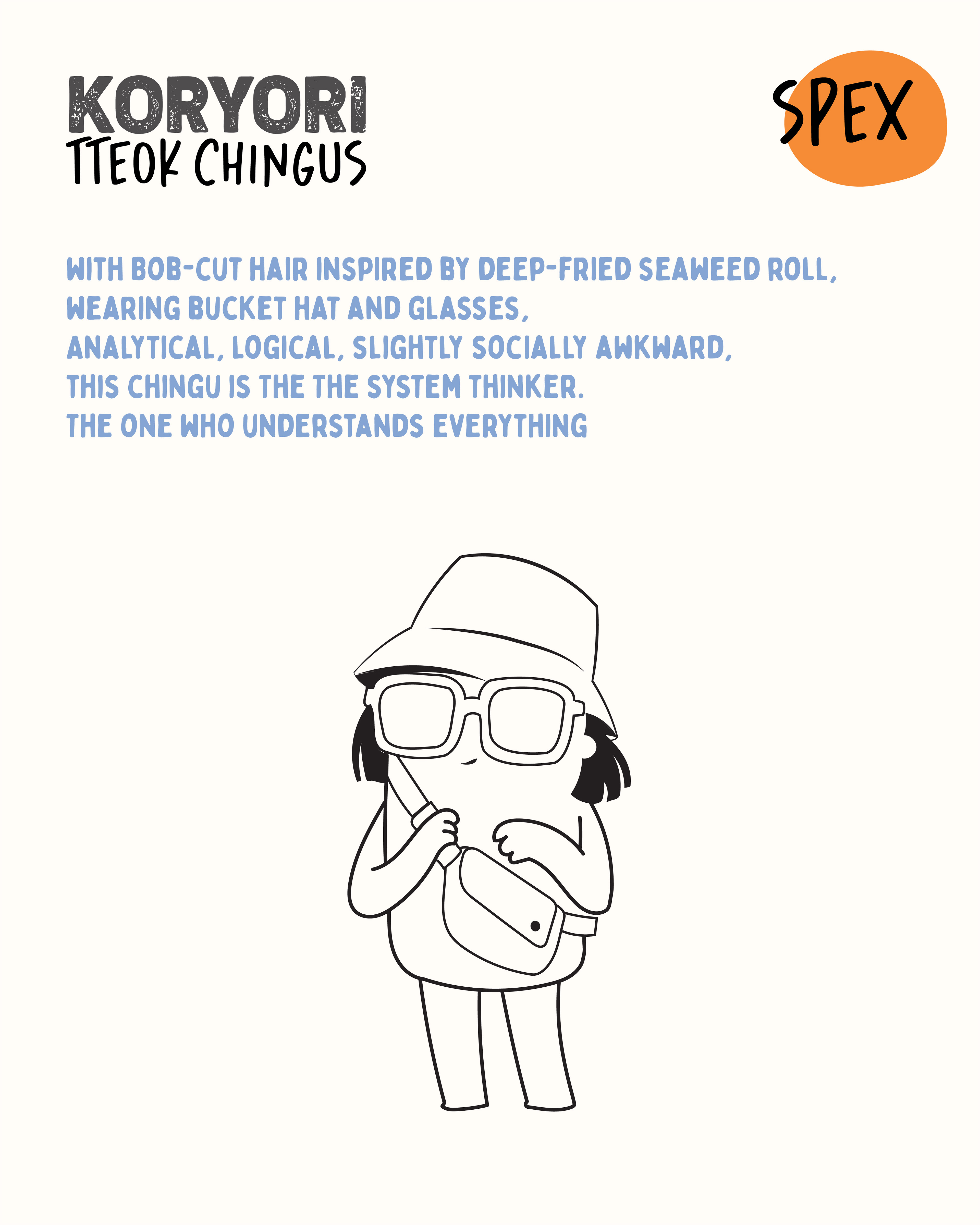
4. Spex, the quiet observer in a bucket hat and oversized frames. And,
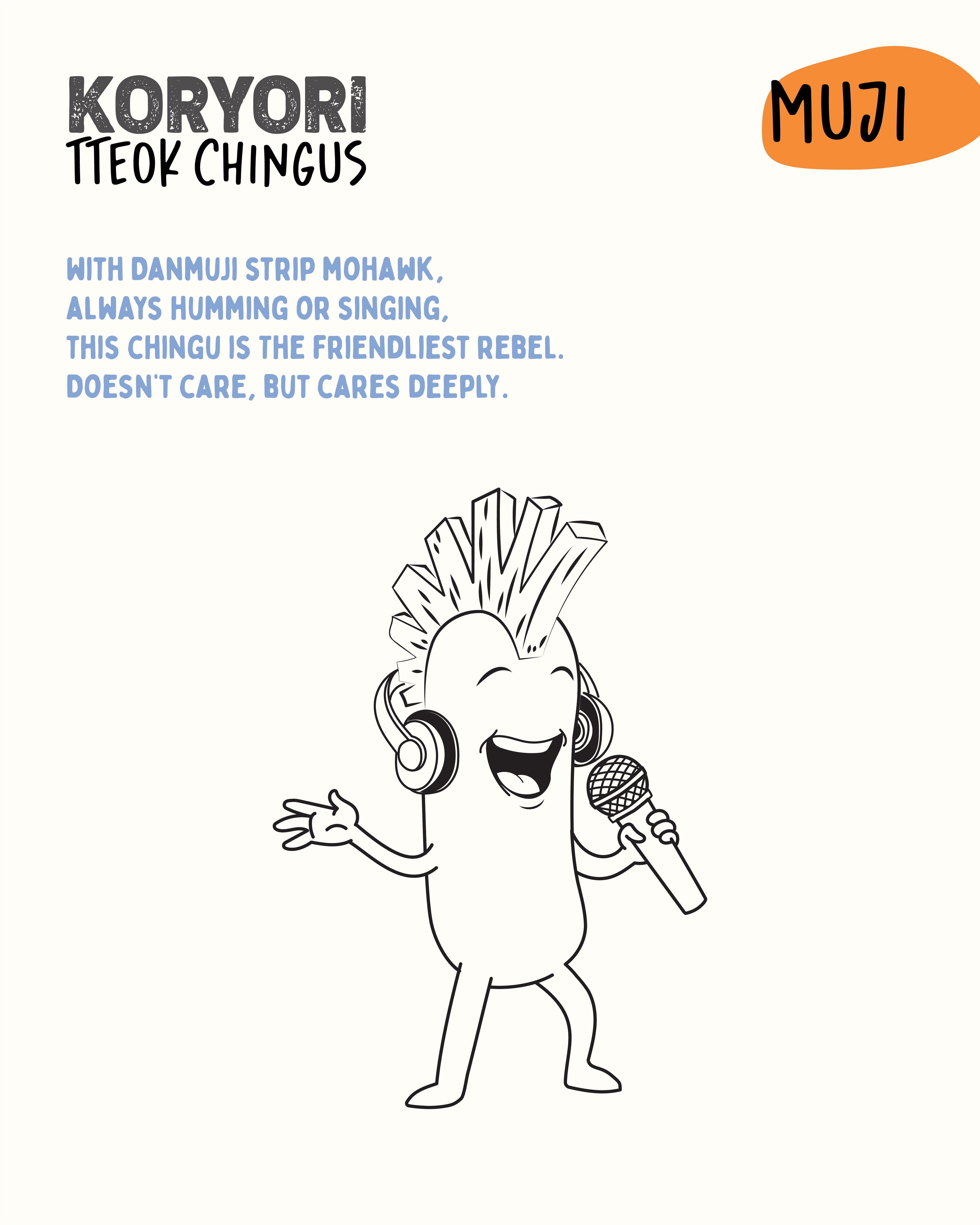
5. Muji, the punk edge of the group with a danmuji mohawk and a karaoke mic.
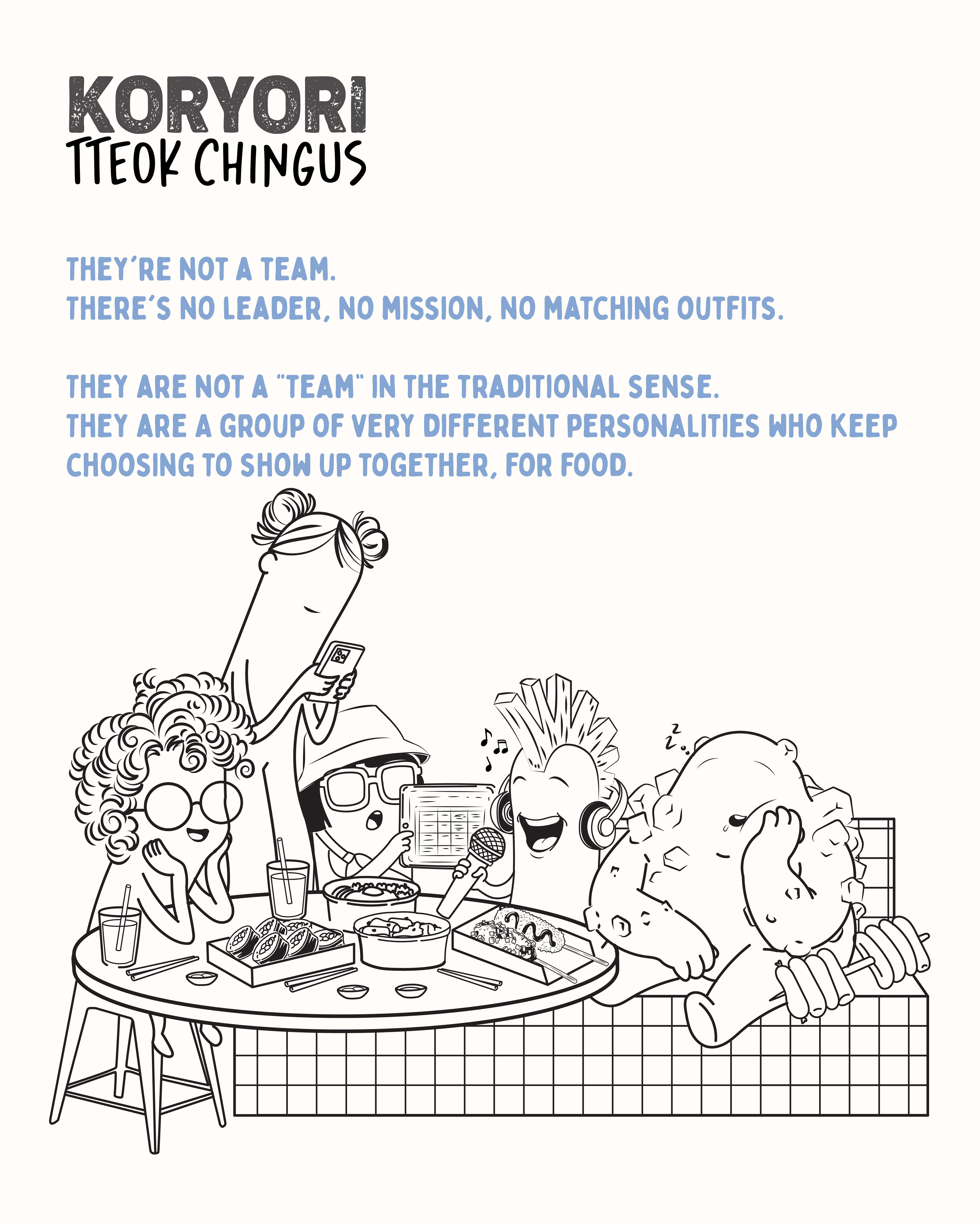
Together they became the Tteok Chingus, a five-character mascot system, each with defined visual signatures, personality traits, and brand use cases.
1. Ramy, the high-energy wildcard with ramen noodle hair.
2. Gamja, the immovable tank in potato armour.
3. Seolin, tall and chic and completely unbothered.
4. Spex, the quiet observer in a bucket hat and oversized frames. And,
5. Muji, the punk edge of the group with a danmuji mohawk and a karaoke mic.
Together they became the Tteok Chingus, a five-character mascot system, each with defined visual signatures, personality traits, and brand use cases.
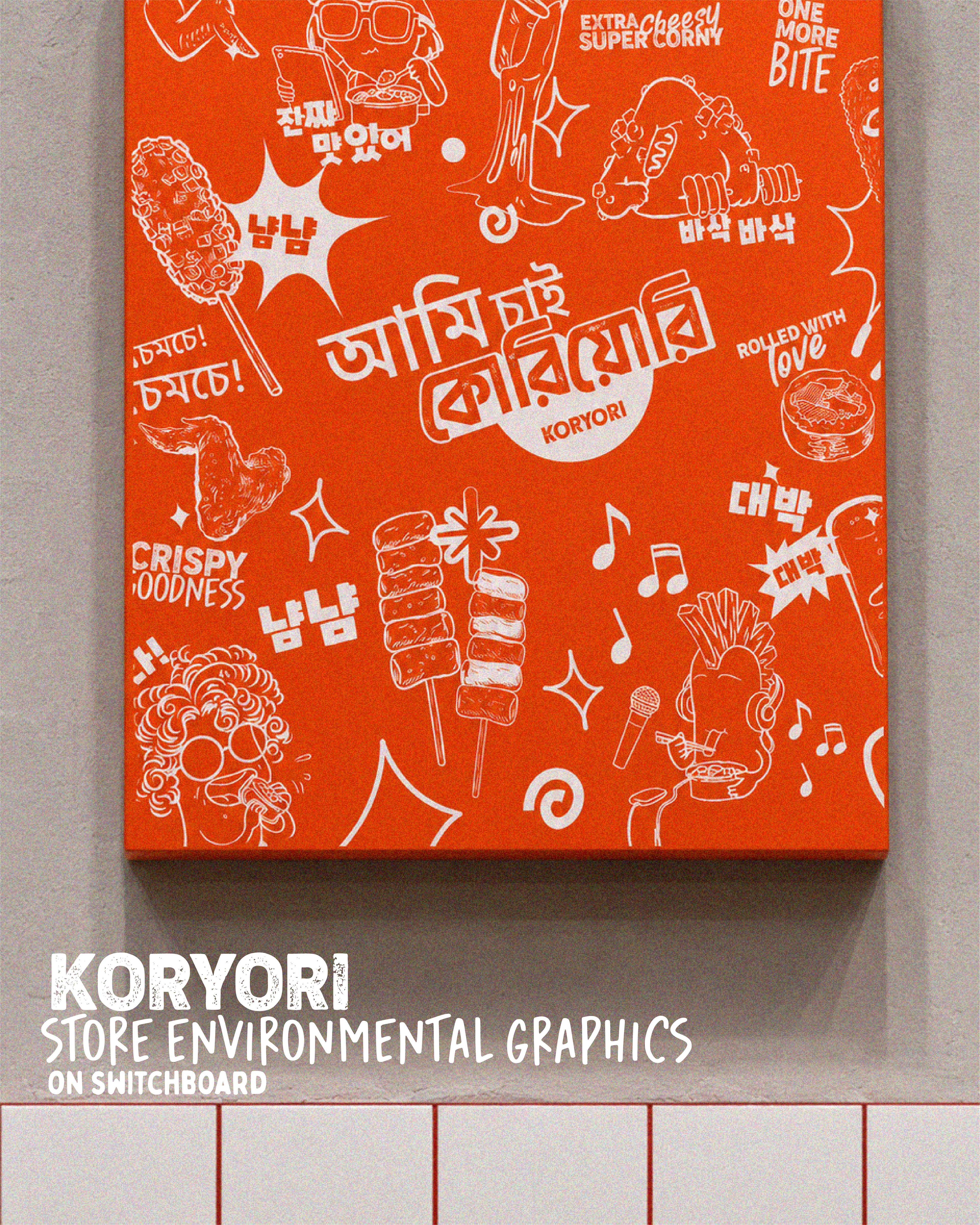
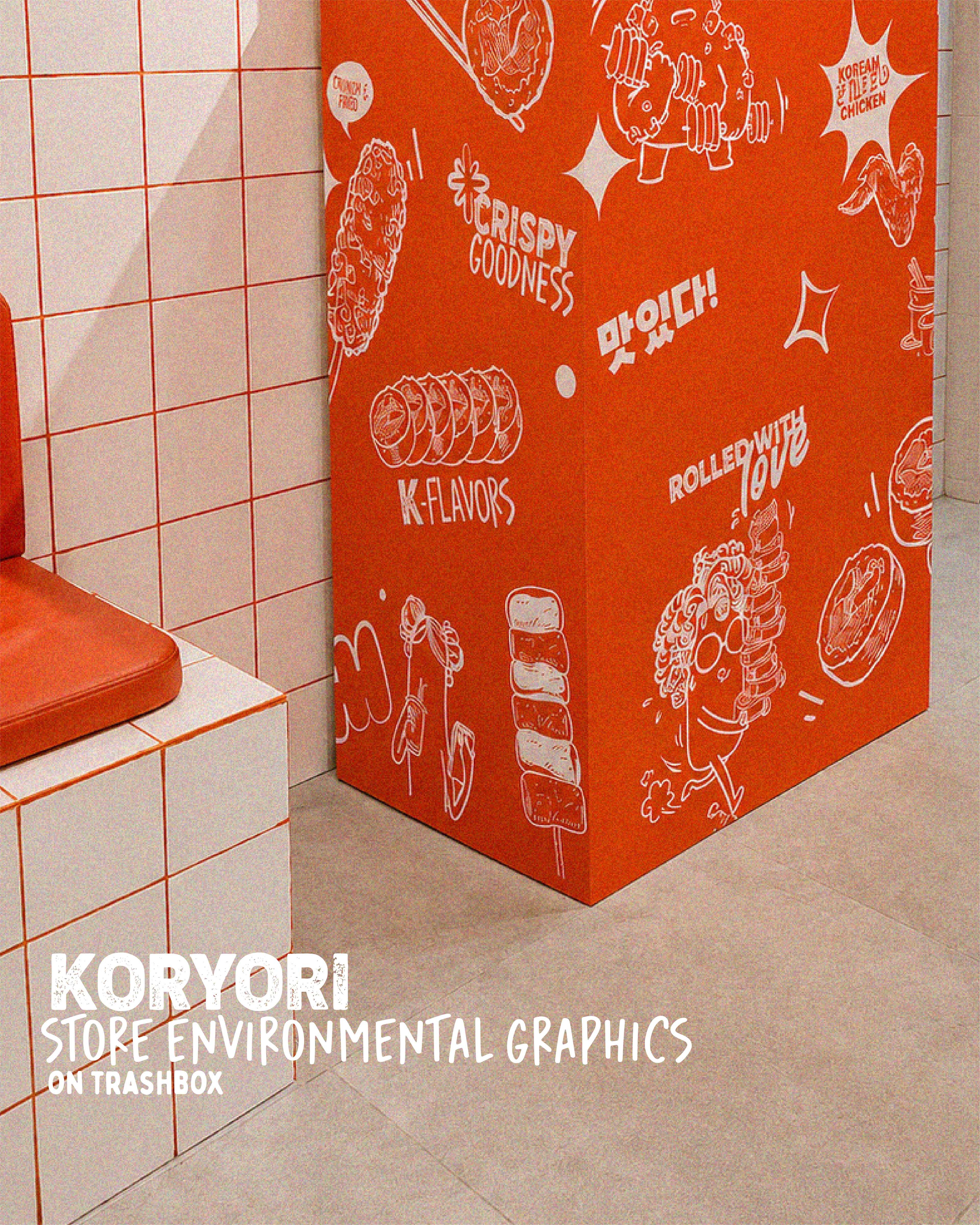
Beyond the characters, the scope extended into building out a fuller visual language for the brand. Custom typography was designed for both English and Korean text, keeping the handcrafted, slightly rough energy consistent across both scripts. A set of food illustrations was developed as supporting assets, items from the Koryori menu translated into a visual style that could sit alongside the characters without competing with them.
The system was then applied across the physical space. Characters and illustrations found their way onto the store interior, switchboard panels, trash box covers, and the storefront glass surface, turning the entire space into an extension of the brand world rather than just a backdrop for it.
Koryori Mascot Characters
Initial Draft Sketches
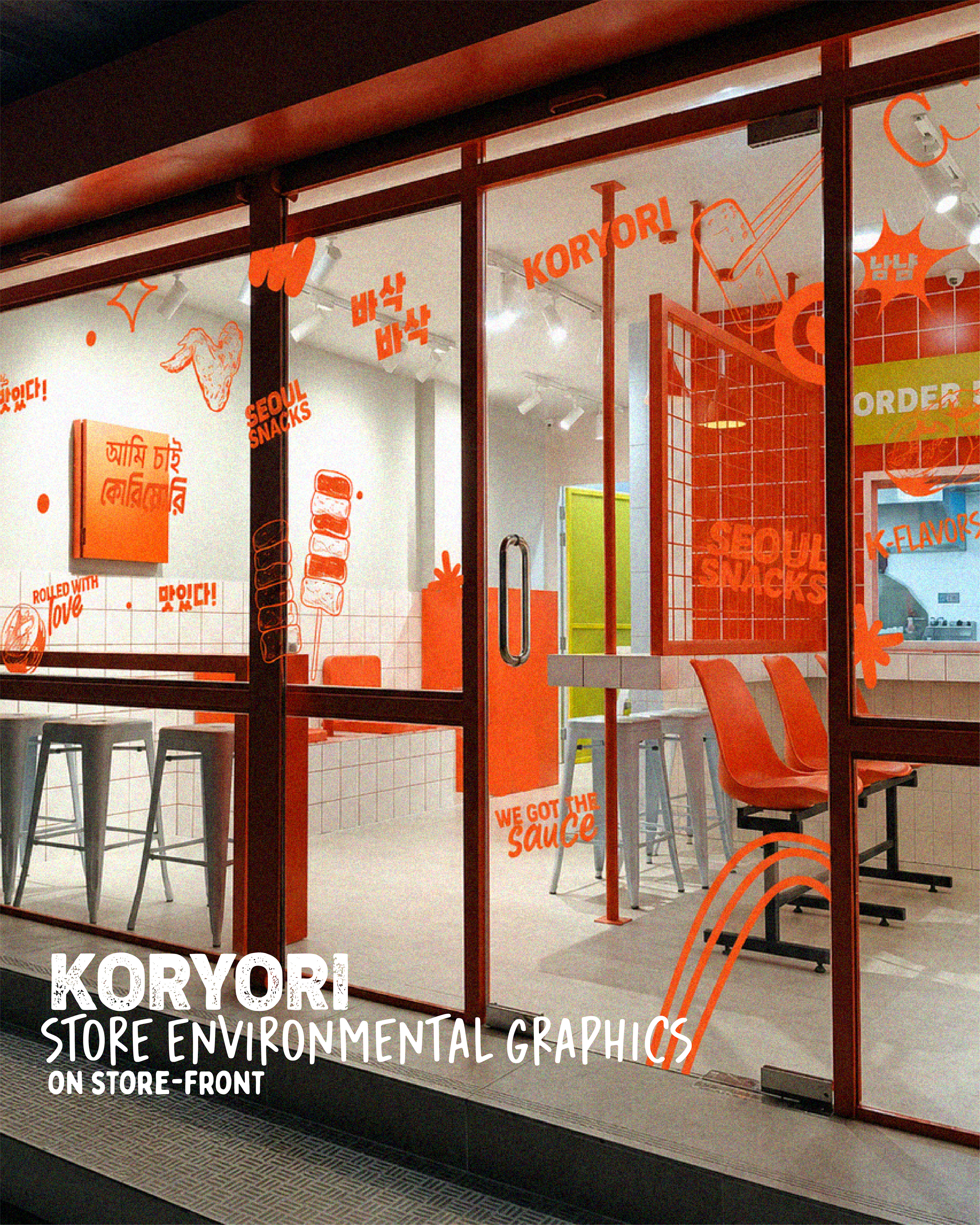
In-store Applications
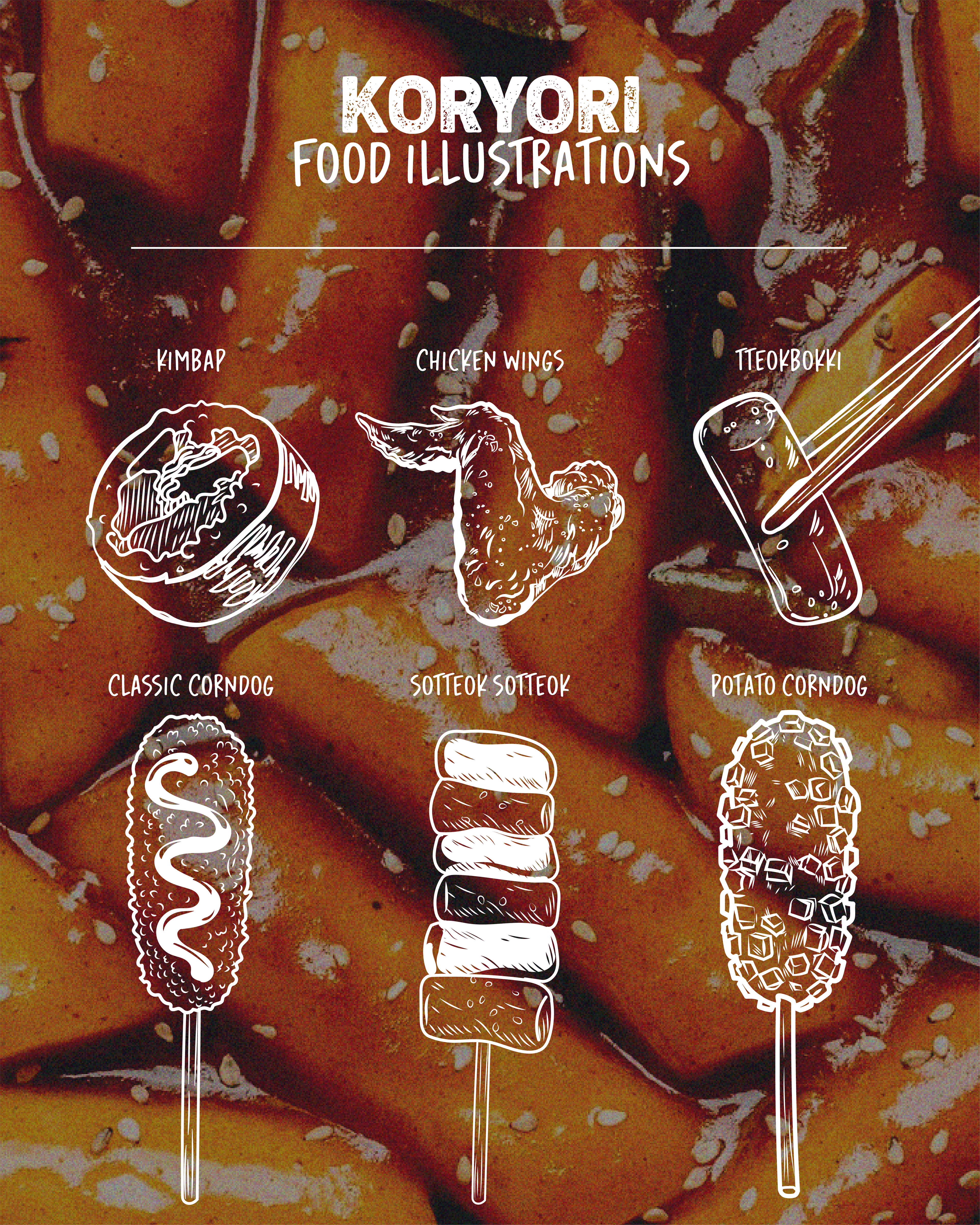
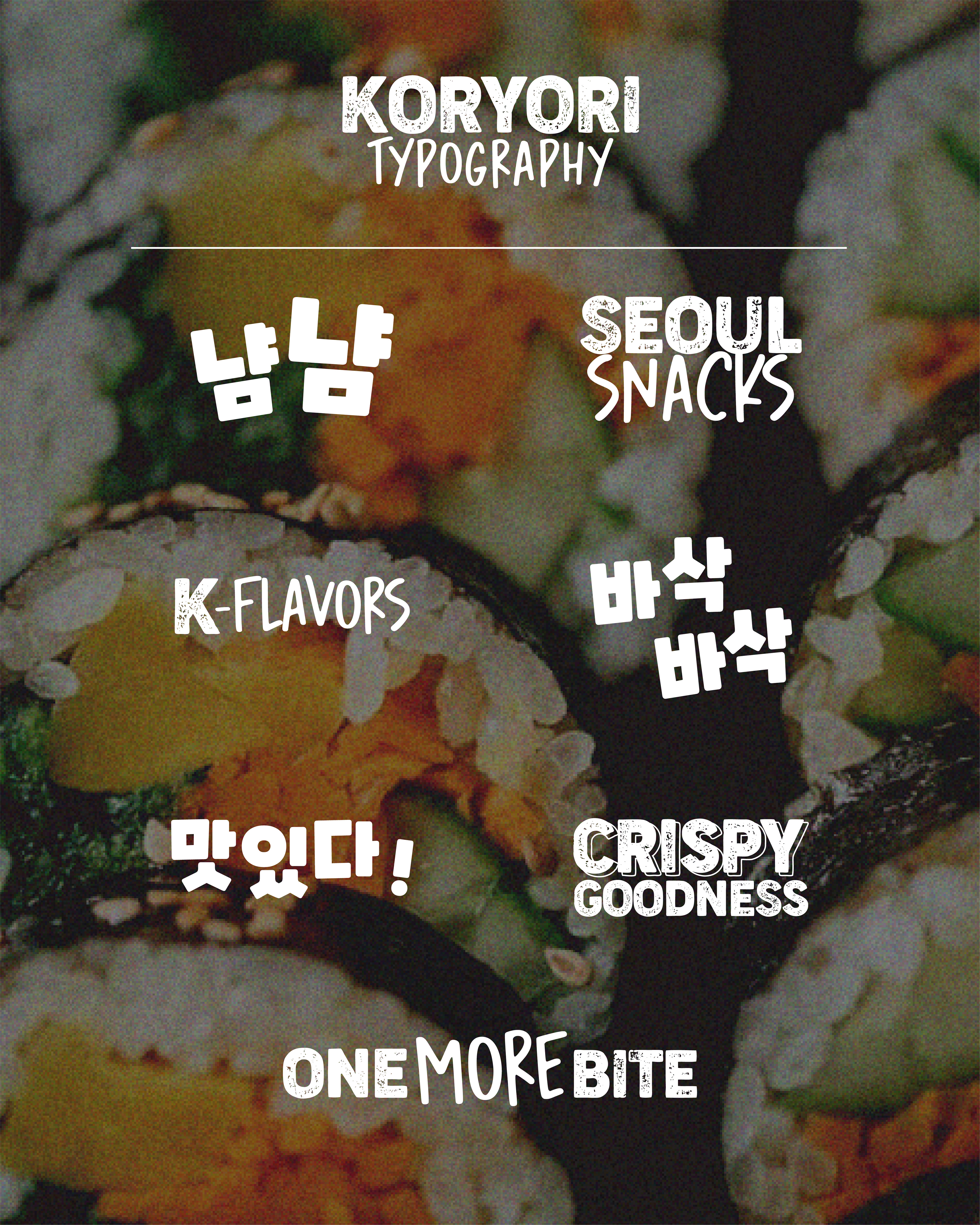
Food Illustration & Typographic Elements
Thank You!